Wednesday, June 29, 2011

Sephora by OPI Gleek Out!

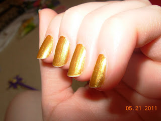
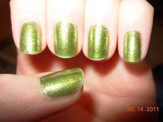
A (somewhat) recent nail that I really liked...Sephora by OPI Gleek Out! from their Glee collection.


(enlarge it to see the detail!!)
This is exactly the kinda polish I love...the bright, foil, juicy looking ones that show just a hint of visible nail line, in the same vein as Express Yourself to Yourself. This was either 2 or 3 coats...I think 3, because since it was a mini bottle, it looked kinda streaky (dang mini brushes!)
This color is so unique in my collection. Although, the OPI Serena Williams color Simply Smashing is fairly close to this, I believe...? I don't have it to compare, but from what I've seen they look pretty similar. I know a lot of people don't like "weird" yellow-greenish colors, but really the shimmer in this keeps it from looking at all gross or anything. Personally, I think the color is different and eye-catching without being too out-there...I know my mom (the queen of reds and pinks!) would disagree, but so be it. (Orange and purple are as far from her comfort zone as she'll go with her fingernails, but she will wear teals and blues on her toes. She's actually what started my polish addiction a while back, so I'm grateful to her!)
As I said, I used the mini bottle of this, but it's also available in a full size bottle (which I'm feeling quite tempted to buy...). Although, truthfully minis are good for me since I don't really use most of my lacquers more than once. Anywho...

Sincerely, Cat
Monday, June 27, 2011

Deborah Lippmann Call Me Irresponsible


I've had this one for a few months now and I have no idea why I hadn't used it so far. Call Me Irresponsible is a purple jelly. I'd heard mixed things about this color before buying it, some people saying it was a perfect formula, perfect color, and all that good stuff...and others saying even after 4-5 coats, it didn't reach bottle color, and that it was a streaky mess, etc. While I don't think I could go with either extreme, if I had to pick a side, I'd say it's much more good than bad...does that even make sense gramatically?
I used 3 coats here (even though I hear 4 is perfect!). The first coat...fairly streaky. Second coat, I began to worry a bit: would it ever be dark enough? And third coat, perfection. It turned out way red toned and as you can see, not much like bottle color...but I like it that way. Instead of a dense, stark purple, it's more soft and shiny. It really does look kind of like a red grape (which I call purple grapes...my mom used to look at me weird when I was little and called them that, haha), if they were lighter. And brighter. But anyways.
Deborah has proven her talent yet again! This color is unique (there's not many purple jellies out there...frankly, there's not many jellies at all out there!), and I do have to admit that once you get past 2 coats, the formula is killer. I'm sure if you went with 4, or even 5 (or even more...) you could get pretty darn close to bottle color. Plus! Jellies can always be layered over white/another more opaque color similar to the jelly, to appear more opaque.
I don't regret this at all...in fact, I'd buy this color again in a heartbeat. As I often say...Lippmann can do no wrong!

Sincerely, Cat

Sunday, June 26, 2011

China Glaze Cyberspace


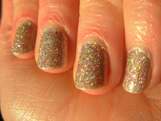
(if you want to see the holo-ness more in depth, please click to enlarge!!)
So today I was pondering which lacquer to use...I've been going through all my untrieds lately (thanks for the inspiration, All Lacquered Up!) and I got to my China Glaze Tronicas. I bought half the collection back around February or March, and of the 6 I have, I've only used 3 of those. So, I decided to try Cyberspace today.
I used 2 coats, no base or top, and it turned out well, I thought. Last time I used a Tronica, I used base coat, which made it go on really streaky and weirdly lumpy-ish. This time was perfect...the formula was spot on. Perfect coverage in 2 coats. I love how holos dry really fast, and sort of matte but with the great shimmer. Also...sorry about the cuticle mess, these pics were taken like an hour or two after doing my nails and I don't exactly have the most steady hand!
As you can tell from the picture, (and as is widely known) the Tronicas were kind of a let-down in terms of holo-ness. Even in sunlight, you can't really see the holo much. Ever since I first got my Tronicas, I've been thinking about this issue, and how some people were so angry that this collection didn't have the same effect as the Kaleidoscope or OMG collections. And today I finally thought...you know, at least China Glaze was awesome enough to make holos, and to listen to the fans that wanted holos. Think of all the brands that don't, and just have collection after collection of pink and red cremes, shimmers, frosts...anything BUT something fun and original. So, yeah, maybe China Glaze could have made their holos more holo-y, but you can't complain since at least they tried.
This is a beige-y shade, but truthfully in some lights it looks a lot like silver. Even without the holo in it, it's still a really pretty, demure shade.
So, to conclude this post, I really love this color, and all the others in this collection that I own. (Speaking of which, I posted Virtual Violet a while back I think...) China Glaze, FTW!

Sincerely, Cat

Saturday, June 25, 2011

Deborah Lippmann Yellow Brick Road

Part 2 of my vacation nails! This was a polish that I bought at the beginning of the trip, and I used it midway through the week when As a Sophomore started chipping.


This is 4 coats, with Northern Lights top coat...very sheer; it's a true jelly. There's a lot of VNL, but I didn't care about that when I was putting this color on, I just wanted to make sure that it was dark enough that it didn't just look like discolored, yellowing nails. I think it turned out pretty good.
I'm a big fan of this color; even if you don't like yellows, you have to admit that it's completely unique. I've never, ever seen a polish that remotely resembles this one (maybe color-wise, but not formula-wise). You have to hand it to Deborah...her lacquers really push the limits, from her amazing glitters to her perfect jellies, and everything between.
Besides the sheerness, application was wonderful. It wasn't streaky, and I know some people just like a sheer bit of color on their nails, so 2-3 coats could definitely be pulled off.
All in all, this color was worth it to me...Lippmanns are expensive but worth every cent! Every one that I've tried has an impeccable formula; the colors are unique and innovative; the brushes are perfect and personally, I've never gotten a defective one; even the bottles are beautiful. I hate to admit this, but...on the trip I bought 6 Lippmanns...and a MAC...and a Sephora by OPI...and also a bunch of Urban Decay makeup...my wallet really, really hates me right now. Ah well, summer vacations happen once a year...gotta take advantage of them!!

Sincerely, Cat

Thursday, June 23, 2011

OPI Ogre-the-Top Blue with Silver Shatter


This is OPI Ogre-the-Top Blue with OPI Silver Shatter over it. I'll just say right away...I LOVE how this looks!! I tried to pick a color that: A, I haven't used; B, that's BRIGHT and will make a bit of a statement (although, truthfully, I change my polish every day and they range from glitters to neons to sheers...I'm pretty sure my nails always make a statement); and, C, was dark enough and would have enough contrast against the silver. OTTB accomplished all of that, I'd say.
I used 2 coats of OTTB, which was very nice, I might add. Good formula, brush, everything. I still can't believe I got it over a year ago and just got around to using it. Although I had used it on my toes last summer (as in a whole year ago!). Actually, I think it was over last year's 4th of July...? Anyways, onto Silver Shatter.
MAN I love it!! Way way better than Black Shatter, which, looking back, I don't even know why I bought 2 bottles of that (one as a backup)...I'm not even that crazy about it. Silver, though...wow. I love that it's like a cross between a foil and a glitter, and it's such a nice shade of silver. It crackled really, really nicely and I love that the blue really got to show through...with some of these recent crackles, you can't even really see the color underneath, and they really don't crack much at all. A lot of them, I've noticed (mostly the cremes) only really crackle vertically...this one crackled in every which way, into actual little groups, and I love that.
The downside to OTTB, though...it stained badly! One of my nails had a huge blue spot after removal that lasted a few weeks until I buffed my nails. Small price to pay, though.

Sincerely, Cat

Wednesday, June 22, 2011

OPI Bling Dynasty

Just a random nail that I recently wore. OPI Bling Dynasty from their Hong Kong collection last spring.


(some of my frankens are visible in the background in the middle 2 pics...lol)
2 coats with Seche Vite. BD is a really nice gold...but it looks terrible on me. Yuck. With my skin tone, this type of gold does nothing for me. Ah well, I still love the color and the formula. Plus, the brush on this one seemed exceptionally nice for some reason....hmm. You know, I love the OPI ProWide brushes so so much. I wish every polish had them. They work so well.
This color was from the Spring 2010 Hong Kong collection. As individual colors, I loved a lot of the lacquers from the collection, but as a whole collection, I thought it was fairly forgettable. There were a lot of nice cremes, and shimmers too, but it just wasn't that memorable. Nevertheless, I so love this color, no matter how awful it looks on me. Speaking of which, some of my friends were looking through my polish collection a while back and doing their nails, and one of my tan friends used this polish...it looked SO good on her. I was totally jealous. Moral of the story: no matter how pretty they are, not all polishes work for everyone!

Sincerely, Cat

Sephora by OPI Express Yourself to Yourself w/ OPI White Shatter


A more recent nail...pictures don't do this justice. This is Sephora by OPI Express Yourself to Yourself, from the Glee mini set. Unfortunately not available in full size!! This has a really nice look to it...one of those nice, juicy glass-fleck-y colors. Really, it was so much brighter and had way more depth in real life...ah well.
I used three coats here, with Northern Lights top coat again. There's still a little bit of VNL, but I'm not one of those people who can't stand it...in fact, I kinda like how VNL looks on these sort of lacquers. Despite the dang mini brush, application wasn't too bad.
For some reason I felt like taking a picture of this next to OPI Wing It! to compare, even though they're really not that similar. Oh well. They're both coral-y glass fleck shimmers, but Wing It! has way more depth. It's really, really beautiful...you can see how much of it I've used, too. For me, that's like using up a whole bottle...haha.

And then I wanted to try out one of my new OPI Shatters, and I decided on White. I really like how it turned out. It actually shattered pretty well too. The coral barely peeks out, but there's a good contrast between the colors, so it worked.

....I must say, the shatter pictures turned out pretty nice! This is probably my favorite shatter look that I've done so far. I did one a few days ago that didn't exactly turn out...let's just say, I won't be posting pictures of it. Ever.

Sincerely, Cat

Tuesday, June 21, 2011

As A Sophomore -- franken


Well hello world...I am officially back from vacation! And tying into that, this is an extra special franken I have to show you today. This is what I wore for the first half of my week in California. It's perfect. I love it. It's "As A Sophomore".
First off, the name. I got it from a Vampire Weekend lyric, from "Cape Cod Kwassa Kwassa". Love that song, so summery! And the name is also very special to me because (augh, the age thing again!) I'm going to be a sophomore this fall. If that isn't a tip-off to my age, I don't know what is. Anyways, I'm planning to wear this for the beginning of my soph year, but I just couldn't resist wearing this for vacation! It's just such a summer color...bright, slightly shimmery, blue. Reminded me of the ocean on a really clear day.
So I used base, 2 coats of this, and then Northern Lights Holo Silver top coat. (Normally I use Seche Vite, but I've been kinda weirded out by the chemicals in it...I mean if you look at the bottle it lists the whole "this contains a chemical known to cause birth defects yadda yadda etc..." and that kinda creeps me out!) And plus I was getting kinda sick of getting tip shrinkage and etc. with SV. So, I just didn't shake up my bottle of Northern Lights and kept all the glitter at the bottom. Worked pretty well, I'd say.
As you can see, this color is a perfect shimmery, turquoise-y blue. Formula was pretty nice. Completely opaque; almost kind of thick. Which proved to be kind of a downside, when this started chipping REALLY REALLY bad about 3 or 4 days into the trip. For this mani, I didn't do it all quick and half-assed...I actually wrapped my tips and all that stuff. It didn't make it the whole week, but whatever. I was getting restless not changing it anyways.
So, I thought it looked dang good. Probably my favorite franken I've made...or at least near the top of the list. I was checking out at Sephora (mwahaha) on the first day of the vacay, and the gal ringing my stuff up asked if I was wearing gel, because my nails were soo shiny!! I thought it was pretty funny.

So there's part 1 of my vacation nails...now, suspense until I post part 2!!

Sincerely, Cat

Monday, June 20, 2011

OPI Steady As She Rose

One of my more recent manis...


OPI Steady As She Rose, from their recent Pirates of the Caribbean Collection. As you can tell...just another pale pink creme. Nothing new, really, but as usual from OPI, this color is done well. Nice formula (I used two coats), nice brush, the name's actually pretty cute (surprisingly). I wouldn't normally go for this color, but for some reason I felt the urge to buy it...I don't regret it or anything, so I guess it was worth it. It's very feminine and proper...quite a departure from my usual greens and blues.

Sincerely, Cat

Monday, June 6, 2011

Deborah Lippmann Lady Sings the Blues

Another oldie...this was my Thanksgiving 2010 mani.

Only one picture this time! I really love this color..and all Lippmanns, I guess you could just say. But I had some problems as you can see from the picture...
First of all...the smell. Anyone else who owns this polish notice that weird odor that this has? I mean, I know nail polish doesn't have the greatest scent in the world...but this is beyond that. It's almost kind of...skunk-y. It's not that bad though that I would never use this again or anything, it was just kind of odd. And once the lacquer dried, I couldn't smell it anymore. If you think I'm on drugs right now or something...I'm not! The reason I took notice of the smell in the first place is because I was looking at the Nordstrom online reviews before I bought this, and someone mentioned the weird odor. I thought they must be a bit odd in the head or something, but I noticed it too. Weird.
Also, the application on this looks really sloppy: I was in a huge rush to get it done, so it didn't look that great and it didn't last long. On the side of the thumb, you can see where it's already started to peel...and this picture was taken the same day I did these nails! Moral of the story: don't rush on your nails!
I got this polish in the All That Jazz set at the Nordstrom sale last summer. Not sure if it's still sold, but the three polishes (this one, Razzle Dazzle, and Some Enchanted Evening) from the set are now sold separately on Deborah's website. I love all three of them, but Lady is probably my favorite. The set was an awesome deal, too...3 lacquers for $40, and they're $18 each. Yay, bargain shopping! Woo!!

Sincerely, Cat

Sunday, June 5, 2011

OPI What's With the Cattitude? and Extra-va-vaganza

Another old nail...but today's my catch up day, okay?


(enlarge for a closer look, like always!)

Please ignore the messiness of it...lol. This is OPI What's With the Cattitude? (the light blue, that is) and the orange-ish (and many other colors of course!) glitter is OPI Extra-va-vaganza. WWtC? is from their Spring 2010 Shrek brights collection, and Extra is from their Holiday 2010 Burlesque collection.
I really really liked this look!! The glitter had a nice contrast with the blue, but the blue was still just visible enough. It looked awesome.

I'll try to keep this post short now! Sincerely, Cat

Color Club Hocus Pocus

This is an old old old post...but I figured I might as well catch up on stuff, right? This was (one of) my Halloween nail looks this past year. Which, I guess was actually over half a year ago...oops. That's besides the point, though.


(Click to enlarge and see it up close!! It looks pretty neat)
I believe this is 2(ish) coats of Color Club Hocus Pocus over a coat or two of OPI Birthday Babe (I'm telling you...I use that one sooo much!). And of course a coat of Seche Vite. HP came in CC's Halloween mini set this past year. I loved that set, and I love CC's minis, because they're not TOO small. They're just half the size of a regular .5 oz lacquer. And they don't have dinky, pain-in-the-ass way-too-tiny brushes like a lot of minis do. And the set had a nice variety....this polish, an awesome neon orange, a standard (but really nice!) black, and a cool dark purple-blue shimmer.
The formula of this wasn't too bad...it was a little thick like most glitters, but nothing unbearable. It's not like a linear holo, but it's got that nice scattered holo look, plus this awesome orange-y red glitter mixed in among the silver glitter. I layered it over the OPI silver so I wouldn't have any bald patches underneath, plus glitter removal is a total bitch and I didn't want to use 3 coats of pure glitter...I hate the removal process!!
So you might think....how is this even a Halloween mani?? It could definitely work for any time of year. Well, first of all, the polish came in a Halloween set, so I can say it's a Halloween mani if I want to! But mostly it's because I added a bunch of Halloween decals a day or two after I took these pics...unfortunately, I didn't take pictures of it then! The decals actually came in the Color Club set too...I have to say, it looked pretty cool! Maybe kinda little kid-ish, but that's what Halloween's all about...right?! Also, I was wearing this mani (with the decals) for my Halloween party. It was pretty dang good...people still talk about it, so I figure it was a success. Anyways...

Sincerely for now, Cat

Friday, June 3, 2011

Milani Digital

Okay, so I know toe swatches are kinda gross...but I really wanted to post these pics of Milani Digital!! I haven't worn it on my fingernails yet but I did a pedi with it...so here it goes...

Seriously, I know toes/feet are a little disturbing to look at, but if you enlarge the pic to look at the holo-ness...MAN I like it!!! It applied nicely (this is 2 coats, no base or top) and it wore really well. Plus, Milani has really really nice brushes.
I got this at Target on clearance...it was originally like $4, marked down to 3, then down to 1.98...so it was a steal!! Unfortunately, this was the only one left. If I had known how nice it was, I would've tried to snap up the others in the "3D Holographic" collection (or whatever it's called) sooner! Oh well...at least I got my hands on this one!

Sincerely, Cat